It is instructive to look at long term air quality trends in Sydney. Why? Because car technology is improving. So maybe, by the time the New M5 is actually opened, enough old cars will have been replaced with new cars so that we will meet the air quality targets anyway even though we have more roads and therefore more cars on the road. Or so I thought.
It isn't just for WestConnex for which air quality is being monitored. The Office for the Environment and Heritage monitors air quality in various locations in NSW including quite a few in Sydney. But we have good PM 2.5 long-term data for only four Sydney location. Why the focus on PM 2.5 data? Because of the four pollutants that are being measured for the New M5, CO and NO2 don't have any exceedances and PM10 has only daily exceedances except for the St Peters Public School site which is now impacted by WestConnex constructions. However, PM 2.5 has plenty of exceedances of annual targets in all sorts of locations.
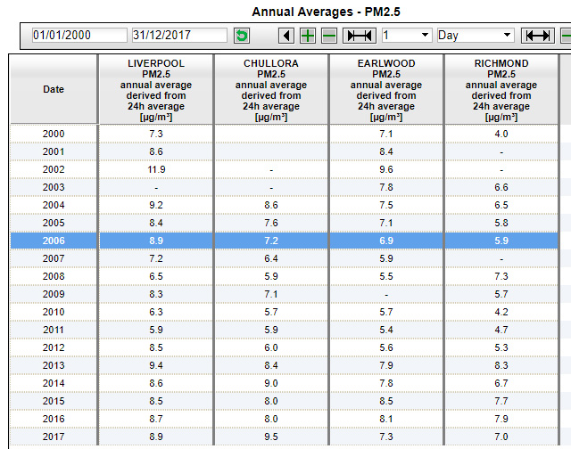
The place to look up long-term NSW air quality data is this OEH site And here is a section from a screen shot:
The annual figures are a little bit up and down. So I grouped the data into 5 year blocks (and marked exceedances of the 8 μg/m3 target in red). See below:
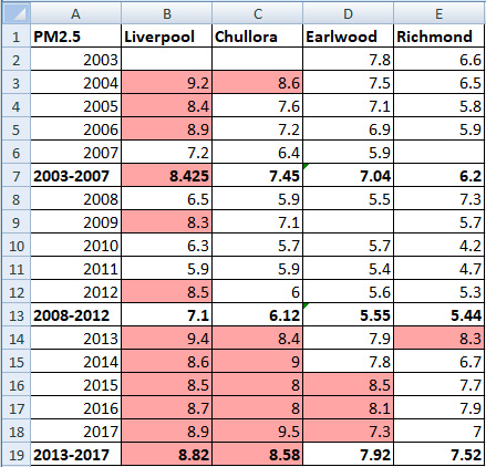
For all four locations, we are finding that PM 2.5 levels did indeed improve from 2003-2007 to 2008-2012. But then they got worse again in 2013-2017, worse even then 2003-2007.
How do we explain this? I actually do believe that car technology is improving and that new cars are less polluting. My initial thoughts were that the explanation is to be found in population growth. More people mean more cars on the roads. Even if there aren't any more roads, we get increases in the amount of driving that occurs which is why peak hours are getting longer and why we are getting more traffic jams on Saturdays. And the increase in the amount of driving evidently outweighs improvements in car technology.
At the September 10, 2018 meeting, I took the opportunity to seek comment from the air quality expert who was present. Although the chairman ruled the questions off-topic (so don't expect my questions or the answers I got in the minutes), he was happy to let the air quality expert answer this. The air quality expert answered that a lot of it depends on weather cycles. Recent years have been drier. And dry years cause more particles from hazard reduction burning and bushfires and also from wind picking up more dust.
Should we believe this explanation? I have now had a chance to think about it. I have no trouble accepting that in dry weather there is more particulate matter in the air from smoke and wind-blown dust. But the question is whether this effect is big enough to produce the J-curve. So, let's have a look at levels of stored water. over time in the chart below from Water NSW.
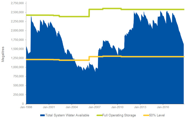
Water levels are obviously also related to how dry the weather is. So let's compare the years. If you look at the years 2003 to 2007 and compare them with 2008 to 2012, what you see is that the water level went up, suggesting the weather getting wetter as PM2.5 levels dropped. So basically, this is consistent with what the air quality expert has been saying. But the years 2013 to 2017 don't seem to be particularly dry, except towards the end, when storage levels started falling again. Yet, PM2.5 pollution went up in those years and not just towards the end.
All that does not prove that the air quality expert is exaggerating the effect of weather cycles. There are complications. For example, we can get PM2.5 pollution from areas outside of our catchment areas. Still, my impression is that there is more to increasing PM2.5 pollution than the weather.
I am continuing to do more research on the is topic but I am constrained by my need to hold down a full-time day job and by the time I want to spend on other environmental issues. Ideally we would have a team of full-time government-funded researchers analysing air quality data as well as weather and other data that is relevant to air quality and giving us a detailed break-down of where our PM2.5 pollution comes from, presented in such a way that people such as myself who are not air quality experts but have a reasonable understanding of science can follow how the figures were determined.